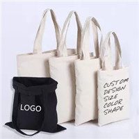
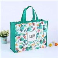
A well-designed bag must be the kind that makes people eye-catching, and good details can beat the mediocrity in nature!
How to make customers who bought your products fall in love with your bag. These people are located in the corners of various cities, and everyone is a carrier to promote our products. How to make the bags in their hands play a big role is also a problem that many companies make designers give priority to.
1. An overview of color psychology
Color psychology refers to the subjective psychological reaction caused by the objective color world. People’s psychological feelings about the color of food packaging are actually a comprehensive reflection of a variety of information, which usually includes knowledge accumulated from past life experiences. For example, “Wangmei quenches thirst” is because people see blue plums, and experience tells us that this kind of plum is acid, which makes people produce corresponding physiological reactions.
(1) The warmth and coldness of the color
Main products: plastic bags; clothing bags; food bags; woven bags; laminated bags; vacuum bags. Red, orange, and yellow are warm colors, which are easily reminiscent of the sun, flames, etc., and produce a sense of warmth; while blue and blue are cool colors, which are easily reminiscent of ice and snow, the ocean, and clear springs, and produce a sense of coolness. In addition, general colors tend to be cold when added with white, and tend to be warm when added with black. Cold colors are mostly used for beverage packaging, and warm colors are mostly used for liquor packaging.
(2) The weight of color
The weight of the color is mainly determined by the brightness of the color. Light colors with high brightness and cold hue colors feel lighter, among which white is light; dark colors with low brightness and warm hue colors feel heavy, among which black is heavy. Colors with the same brightness and high purity feel lighter, while cool colors appear lighter than warm colors.
(3) The distance of color
Some of the colors on the same plane make people feel prominent or closer, and some make people feel retreat or farther away. The sense of advance and retreat at this distance mainly depends on the brightness and hue. Generally, warm colors are near, cool colors are far; bright colors are near, dark colors are far; pure colors are near, and gray is far; bright colors are near, and fuzzy colors are far; contrasts are near and contrast. Faint color far away. Bright, clear warm colors help to highlight the theme; fuzzy, dark, cool colors can set off the theme.
(4) The sense of taste of color
In food packaging, color can cause the taste of food. When people see the red candy packaging, they feel the sweetness; when they see the light yellow color on the cake, they feel the scent of milk. Generally speaking, red, yellow, and white have a sweet taste; green has a sour taste; black has a bitter taste; white and blue have a salty taste; yellow and beige have a milky taste. Different tastes of food, using corresponding color packaging, can arouse consumers’ desire to buy, and achieve better results.
(5) Luxurious and rustic sense of color
Bright colors with higher purity and lightness, such as red, orange, and yellow, have a strong sense of luxury, while heavy colors with lower purity and lightness, such as blue and green, appear simple and elegant. Reading: Color matching skills for food packaging
2. The relationship between the color psychology of food packaging and age
As people change with age, their physiological structure also changes, and the psychological effects of color are also different. Most children like very bright colors, and the two colors of red and yellow are the preferences of ordinary babies. Children aged 4-9 love red, and children aged 9 love green. A survey shows that boys’ favorite colors are green, red, yellow, white, and black, and girls’ favorite colors are green, red, white, yellow, and black. Green and red are common colors for boys and girls, and black is generally unpopular. This statistical result shows that teenagers prefer green and red. The reason is that green and red are reminiscent of the vibrant nature and the vibrant red flowers and green trees in the natural world. The preference of these colors is strong, simple and innocent. The psychological characteristics are consistent. Due to the rich life experience and cultural knowledge of adults, the love of colors is not only from the association of life, but also has more cultural factors. Therefore, the design of food packaging in accordance with the color psychology of consumer groups at different age levels can be targeted.
3. The color and sensory perception of food packaging
In addition to the main flavors of sour, sweet, bitter, spicy, and salty, there are also strong and light flavors. To express so many tastes on the packaging, and to convey the correct taste information to consumers, the designer must perform the performance according to the methods and rules of the above-mentioned people’s understanding of things. For example, the fruit of red gives people a sweet taste. Therefore, red is used for packaging mainly to convey the sweet taste. In addition, red also gives people a warm and festive association. Therefore, the application of red to food, tobacco, and wine has a festive and enthusiastic meaning. The yellow color is reminiscent of freshly baked pastries, exuding an attractive fragrance. Therefore, when expressing the flavor of food, yellow is often used. Orange-yellow is between red and yellow, and its taste is like orange, sweet and slightly sour. When expressing freshness, tenderness, crispness, sourness and other taste and taste, it is generally expressed in the color of the green series.
When we have a good grasp of the use of these colors, our custom-made bags will be well accepted by more people, which will help us better promote them free of charge.
